Designer Speak 101

Get the Word Out
Designer Speak 101:
If you’ve ever worked with a graphic designer, you’ve probably heard them use words like “vector”, “raster”, “high-resolution”, “negative space”, “visual hierarchy” ... and thought, “What in tarnation are they talking about?” We get it. It’s a lot... and we decided to study these terms for a living!
“Why do I need to know designer lingo, that’s what I pay you for?” Well my friend, that can be summed up in two words. Cost. Reduction. Understanding your designer’s lingo means less miscommunication between you and your designer when working on your project. It’s like going to the doctor and telling them you feel bad, but being unable to identify your symptoms and expecting them to know what is wrong with you. It can be frustrating! Knowing the lingo leads to more productive revisions and less time going in circles trying to get the vision in your head onto your designer’s screen. After all, both parties want the design to be pure perfection! With that said, let’s talk about the most common terms you’re going to hear your designer say to you:
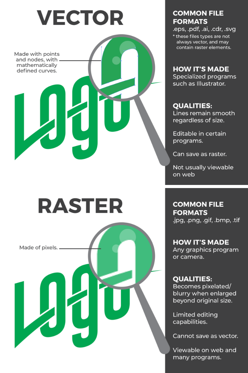
VECTOR:
Vector artwork is a type of artwork that uses the power of math and points to create graphics that can be scaled
infinitely without losing any image quality. Your image will look exactly the same whether it be on a small business card or on the side of your box truck. Perfect quality every time!
RASTER:
You encounter raster artwork everyday without even knowing it! Raster artwork uses pixels to create it’s picture. The pictures you take on your phone are raster files. These have a predetermined maximum size. There are loopholes to change the size of your picture, which your designer knows all about. However, they cant’ work miracles, so they need high-resolution images to work their magic.
HIGH-RESOLUTION:
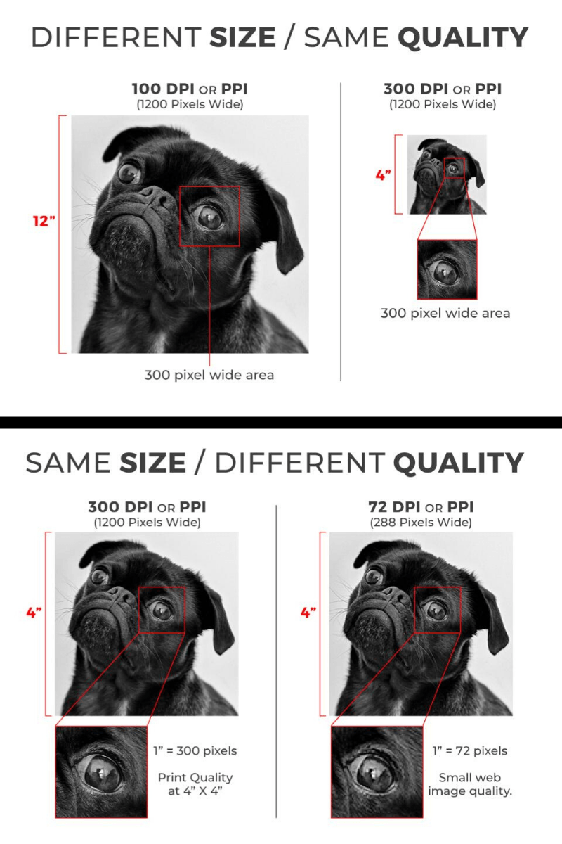
“I took this picture on my phone, so surely it will work right?” Well, not always. As mentioned, raster images have a predetermined maximum size, so they can only be manipulated so far before the image looks like garbage. When your designer says “high-resolution”, they generally mean an image that is of large pixel dimensions and high DPI (Dots Per Inch). The DPI is what gives the image its quality. HIGH DPI images have more dots in one inch square than a LOW DPI image. Bigger is better right? Ideally, you want your pictures taken with a professional quality camera, not a smart phone. While some smart phones can take pictures of large pixel dimensions, their DPI is low, which makes enlarging the picture nearly impossible without the image becoming pixelated or blurry. If you’re unsure of your images’ quality, your designer will be able to tell you, just send it over!
NEGATIVE SPACE:
Imagine that moment when you pull into your driveway. You turn off the car and the radio, and sit there in complete silence. You’re just there with nothing going on, and it’s magical. Negative space is that special area of your design with absolutely nothing in it. This is what gives your design balance. If everything is crammed and as large as possible, your viewer has no idea where to start and has a harder time digesting what you are wanting them to, which kind of defeats the purpose, doesn’t it? Negative space is your design’s happy place.
VISUAL HIERARCHY
EVERYTHING. DOES. NOT. HAVE. TO. BE. AS. BIG. AS. HUMANLY. POSSIBLE. (You can tell we feel very strongly
about this.) If you tell your designer your logo needs to be bigger, and your website, and your phone number, you know what... make it all HUGE because the information is SUPER IMPORTANT, then to your viewer, nothing is important. Visual hierarchy is what tells your viewer what is the most important thing that they should walk away from your design knowing. For those of us who have ever made a recipe from Pinterest, we know that we have 80 years of biography to read before we get to the good stuff, but none of us want to know what Karen’s life was like before she made this life changing recipe. We scroll as fast as we can to get to the thing that looks like a recipe. We are able to identify the break between Karen’s life story and the recipe because the visual hierarchy allows us to detect it. Bold headers, larger fonts, different colored text. All these things help create visual breaks and importance.
Other Recent Posts

We all want that fresh, brand-new shine when it comes to keeping your car looking pristine. But let's face it: the world outside is full of hazards. From unexpected rocks and debris flying up on the highway to the harsh sun fading your paint job over time, protecting your car's exterior can feel like a constant battle. That's where Paint Protection Film (PPF) comes in, and honestly, it’s one of the best investments you can make for your vehicle. At Cool Touch Graphics, we’re passionate about helping you preserve your car's beauty and value, and we believe PPF is an essential tool to make that happen. So, What Exactly is PPF? Simply put, Paint Protection Film is a transparent, ultra-thin layer that acts like an invisible shield for your car’s paint. It protects your vehicle from scratches, chips, fading, and other everyday wear and tear. The best part? Modern PPF is more advanced than ever, featuring self-healing technology. This means small scratches and marks can disappear with the help of heat, like from the sun or warm water, keeping your car looking flawless for years. Why Should You Consider PPF for Your Car? 1. Protection from Everyday Hazards Your car is constantly at risk when you’re out on the road. Whether driving through busy city streets or cruising down the highway, debris and stones can easily chip your paint. PPF acts as a protective barrier, shielding your car from those little impacts that could otherwise leave permanent damage. 2. Boost Your Car’s Resale Value Your car’s appearance plays a significant role in its value. Dings, scratches, and faded paint can significantly lower the price when it’s time to sell. By investing in PPF, you’re keeping your vehicle in top condition. Not only will it look better, but it will also retain more of its value when it’s time to trade it in or sell. 3. Defense Against UV Rays and Chemicals The sun can be brutal on your car’s paint. Over time, UV rays break down the paint, causing it to fade and lose its vibrant look. But with PPF, you get protection against those rays, helping maintain your car’s color. Plus, PPF acts as a barrier against harmful chemicals like bird droppings, tree sap, and even acid rain, all of which can stain or damage your paint. 4. Self-Healing Technology for Minor Scratches One of the coolest features of modern PPF is its self-healing properties. Tiny scratches or scuffs on your car’s surface can fade away when exposed to heat, like the sun or warm water. This helps keep your vehicle’s exterior fresh and smooth for years without constant touch-ups. 5. Invisible Protection with a Glossy Finish Unlike older protective options, such as car bras, PPF is entirely transparent. It seamlessly blends into your car’s paint, offering protection without altering the look of your vehicle. It enhances the gloss, giving your car a shiny, sleek finish that looks as good as it feels. Is PPF Really Worth the Investment? Absolutely! While the upfront cost of PPF might seem like a significant investment, think about the long-term benefits. Its protection will save you money on repairs and repainting over time. Plus, it’s a great way to keep your car looking newer for longer. Whether you have a brand-new vehicle you want to protect or an older model that needs a little TLC, PPF is a wise investment that keeps your car looking its best. Ready to Protect Your Car? At Cool Touch Graphics, we specialize in applying high-quality Paint Protection Film tailored to your car’s needs. Whether you want protection for high-impact areas like bumpers and hoods or full-body coverage, we’ve got you covered. Our expert team ensures a seamless installation that enhances your car's appearance while protecting it from damage. Don’t wait until your car’s paint starts showing signs of wear. Reach out to Cool Touch Graphics today to schedule your PPF installation and give your vehicle the protection it deserves. Your car will thank you for it!
At Cool Touch Graphics, we’ve worked with incredible clients from different industries, helping them craft logos that leave a lasting impression. Over the years, we've watched design trends come and go, but one thing stays the same: your logo is the first thing people notice about your brand, and it’s gotta make an impact! Now that we're well into 2025, it’s clear that while some design trends are sticking around, plenty of exciting new twists are on the horizon. We’re here to guide you through the top trends shaping this fresh era and show you how we can help your business stay ahead of the game. 1. Minimalism
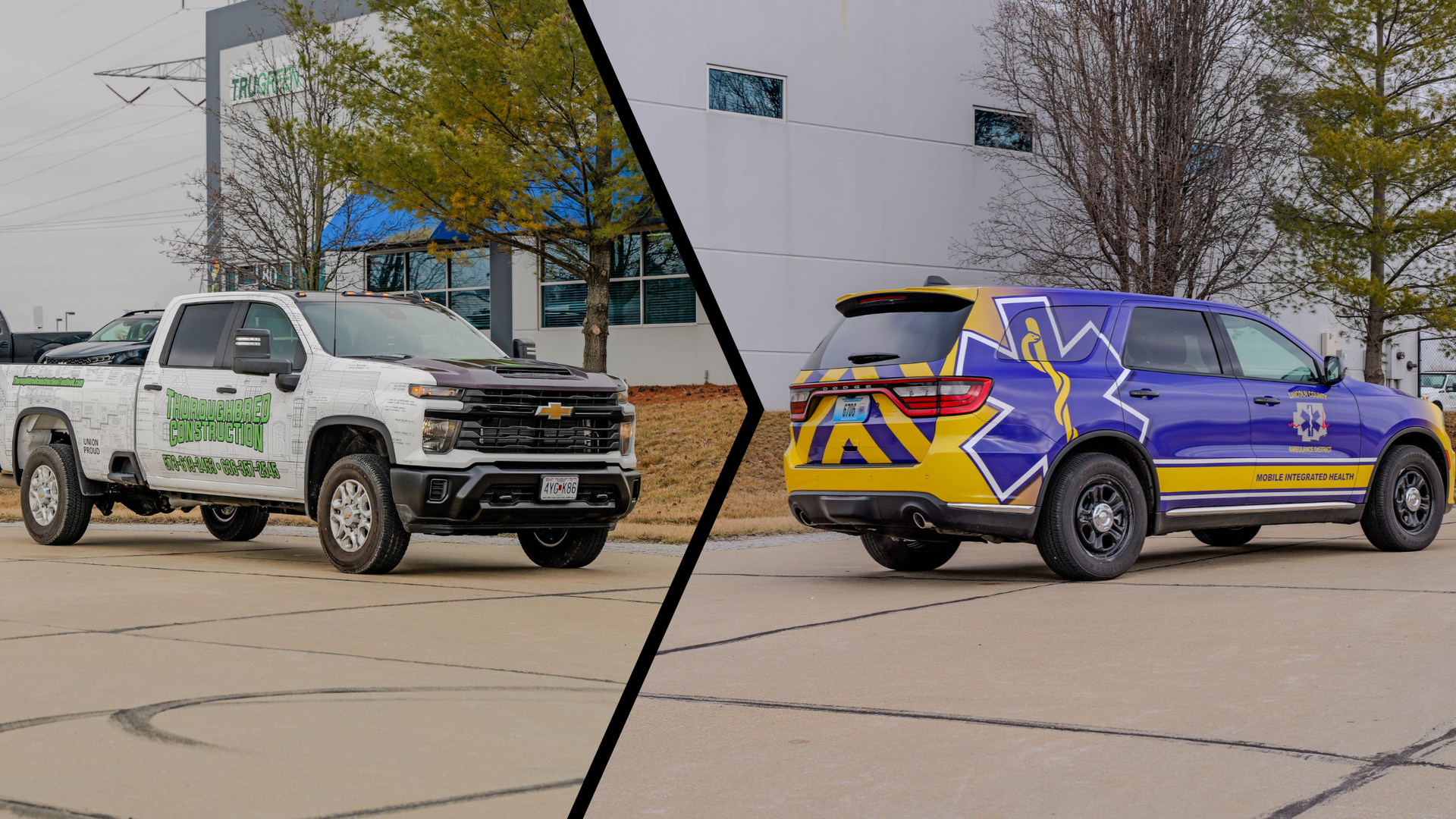
As we roll into 2025, it’s the perfect time to think about how your business can stand out—especially on the road. Vehicle wraps are an incredibly effective marketing tool; staying on top of the latest trends can give you a competitive edge. By embracing what’s trending, you’ll ensure your brand stays relevant, fresh, and visible. At Cool Touch Graphics, we help you take the hottest design trends and adapt them to match your brand’s unique personality perfectly. Here are the top trends in vehicle wraps that you might want to try this year: 1. Bold and Minimalist Designs

If you’ve ever seen a brand that just clicks—where every part feels like it belongs together—you know how powerful a cohesive brand can be. Everything from your website to your social media should feel like a natural extension of your brand. And while digital marketing often gets the spotlight, let’s not forget about print materials. They go a long way in offering a unique sensory experience. Think about the feel of the paper, the weight of a business card in your hand, or the glossy finish on a brochure. These tangible items create a lasting impression that's hard to replicate online. But how do you make sure your print materials are helping—not hurting—your brand? Let’s dive into the essential elements that contribute to cohesive branding in print and share a few tips to get you on the right track. Key Elements of Cohesive Branding in Print To make sure your print materials are working for you, here are the elements that need to stay consistent: • Logo Placement: Your logo is the face of your business, so it should be prominently displayed on all materials. Keep it where it’s easy to spot without overwhelming the design. • Color Scheme: Colors are powerful . They can evoke emotions and create a mood. Make sure the colors you use across your print materials match your brand's identity and feel cohesive. Those colors should be in your brochures and flyers if you use bright colors online. • Typography: The fonts you choose tell a lot about your brand’s personality . Are they formal or playful? Bold or subtle? Pick a few consistent fonts that work well together and stick to them across all materials. • Messaging and Tone: How you speak to your audience is as important as how your materials look. Whether you’re friendly, professional, or inspiring, make sure your tone is consistent. Your audience should feel the same vibe when they read your business card as when they look at your flyer. Tips for Ensuring Consistent Branding Across All Print Materials Creating a cohesive brand is one thing, but maintaining it is another. Here are a few tips to make sure your print materials stay consistent: • Partner with a Trusted Printing Company: A great printing partner makes all the difference. At Cool Touch Graphics, we work with businesses of all sizes, providing top-notch print quality and ensuring your branding is spot-on. • Create a Brand Style Guide: A style guide is like a rulebook for your brand. It outlines how to use your logo, colors, fonts, and tone. With a style guide in hand, your team can create marketing materials that always feel on-brand. • Review and Update Regularly: Make sure you review your print materials every so often to ensure they’re still up to date with your latest branding. Don’t let old designs slip through the cracks! Types of Print Materials That Boost Engagement From the classic to the creative, here are just a few types of print materials that can help elevate your brand: • Business Cards • Magnets • Customized Stickers • Brochures • Flyers • Folders • Notepads • Thank You Cards and More! No matter what you need, Cool Touch Graphics is here to bring your print materials to life and ensure they match your brand’s vibe.
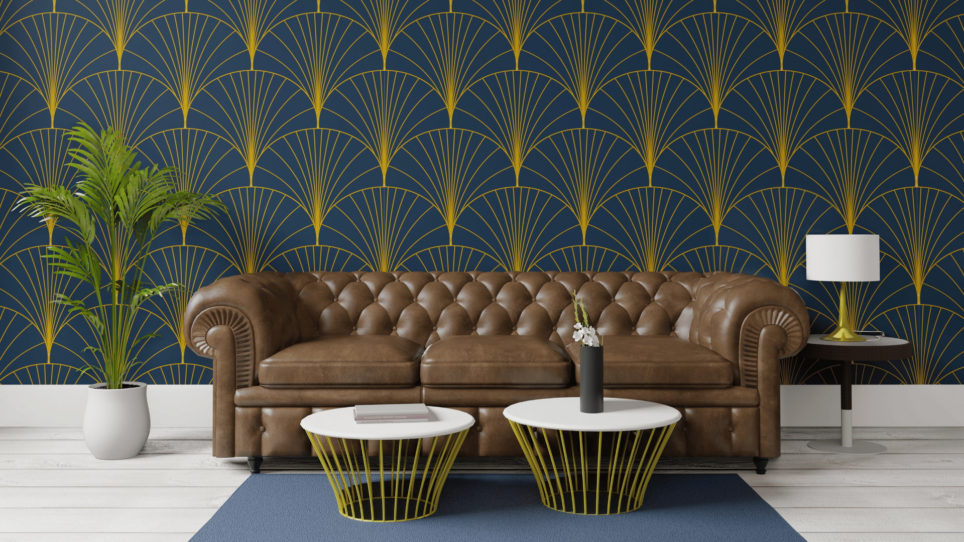
Decorating a rental space can be challenging. Most leases include strict rules about altering walls, painting, or making permanent changes. These restrictions often leave renters feeling limited in expressing their personal style. Enter peel-and-stick wallpaper—a renter-friendly, stylish, and versatile solution that is transforming rental spaces everywhere. In this blog, we’ll explore why peel-and-stick wallpaper is ideal for renters and how to use it to elevate your rental space. What Makes Peel and Stick Wallpaper Ideal for Renters? Peel-and-stick wallpaper is a modern alternative to traditional wallpaper and paint. Here are the key reasons it’s perfect for renters: 1. Easy Application and Removal Peel-and-stick wallpaper is designed for effortless application. Simply peel the backing and stick it to the wall. No messy glue or special tools are required. Even better, it’s just as easy to remove. Unlike traditional wallpaper, it doesn’t leave residue or damage the wall, making it a worry-free option for renters who need to leave their space in pristine condition. 2. Temporary Yet Durable Although it’s removable, peel-and-stick wallpaper is built to last. High-quality options can stay in place for years, ensuring you enjoy your stylish space without constant adjustments. When it’s time to move out or redecorate, it comes off cleanly without damaging the surface. 3. Cost-Effective Design Solution Renters often seek budget-friendly ways to personalize their spaces. Peel-and-stick wallpaper is an affordable way to achieve a designer look without investing in permanent changes. Many brands offer various styles, patterns, and price points, ensuring an option for every budget. 4. Endless Style Options From bold patterns and bright colors to subtle textures and minimalist designs, peel-and-stick wallpaper comes in various styles to suit any aesthetic. Whether you’re looking to create a statement wall, add a pop of color, or enhance a room’s overall vibe, there’s a wallpaper design for every taste. How to Use Peel and Stick Wallpaper in a Rental Peel-and-stick wallpaper isn’t just for walls! Its versatility allows you to use it creatively throughout your rental. Here are some ideas to inspire you: 1. Create a Feature Wall A feature wall can completely transform a room. Choose a bold pattern or vibrant color to make a statement in your living room, bedroom, or dining area. A feature wall adds character and depth without overwhelming the space. 2. Update Your Kitchen Backsplash If your rental kitchen has a dull or outdated backsplash, peel-and-stick wallpaper is a quick fix. To update your kitchen without breaking any rental rules, opt for a design that mimics tile, marble, or another stylish material. 3. Revamp Furniture Peel-and-stick wallpaper can breathe new life into tired furniture. Cover the back panels of bookshelves, the front of drawers, or tabletops to create unique, personalized pieces. This trick is especially helpful if your rental includes furnished spaces that feel generic or outdated. 4. Refresh Your Bathroom Bathrooms in rentals are often plain and uninspiring. Peel-and-stick wallpaper can add a splash of personality to your bathroom walls or even the exterior of a clawfoot tub. Just make sure to choose a water-resistant option for areas prone to moisture. 5. Customize Closets and Storage Areas Closets and storage areas often get overlooked when decorating, but they’re perfect candidates for peel-and-stick wallpaper. Add a fun design to closet doors or interior walls for a delightful surprise whenever you open them. 6. Temporary Wall Art Cut peel-and-stick wallpaper into shapes or patterns to create temporary wall art. This is a great option for renters who want to experiment with decor or frequently change things. Tips for Applying Peel and Stick Wallpaper To get the best results, follow these tips when using peel-and-stick wallpaper: • Prepare the Surface: Ensure your wall is clean, dry, and smooth before applying the wallpaper. Dust and imperfections can affect adhesion. • Measure Twice, Cut Once: Take accurate measurements and plan your layout before cutting the wallpaper. This minimizes waste and ensures a seamless look. • Use a Squeegee: Smooth out air bubbles and creases with a squeegee or similar tool as you apply the wallpaper. • Test a Small Area: Before committing to a full wall, test a small section to ensure the wallpaper adheres well to the surface and meets your expectations. Ready to transform your rental with peel-and-stick wallpaper? Peel-and-stick wallpaper is a game-changer for renters who want to make their spaces feel like home. It’s stylish, affordable, and non-permanent, making it the perfect solution for those working within the constraints of a rental agreement. From feature walls to furniture makeovers, the possibilities are endless. Explore the countless designs available and let your creativity shine. You can turn your rental into a personalized haven that reflects your unique style with just a little effort.
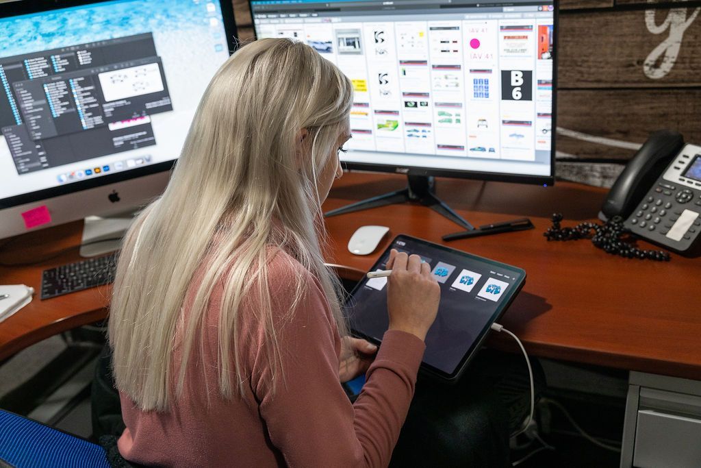
Want to take your brand to the next level? You can try many things—social media campaigns, email marketing, influencer partnerships—but one game-changer can genuinely elevate your business: Graphic design. If you're serious about building a strong brand identity, boosting awareness, and connecting with your audience more meaningfully, graphic design is your secret weapon. It’s not just about pretty pictures—it’s about crafting visuals that communicate who you are and what you stand for. Rebranding? A fresh, memorable logo could be precisely what you need. Do you have an upcoming event? A well-designed flyer will make sure everyone knows the details and gets excited. Moving into a new office? Turn that space into a visual experience with custom wall graphics that leave a lasting impression. In this article, we'll explore how investing in graphic design services from Cool Touch Graphics can help you stand out and set your brand on a path to success. Ready to make your brand unforgettable? Let’s dive in! Why Invest in Professional Graphic Design? Have you ever seen a flyer or ad that made you stop and think, ‘Wow, that looks professional’? That’s the magic of investing in professional graphic design. Great design makes a huge first impression—it grabs attention and makes people want to stick around. Whether it's a clean logo, bold signage, or eye-catching wall art, the right visuals create a memorable experience. Plus, professional design keeps everything consistent. Your branding elements and marketing materials will all look like they belong together, making your brand feel unified and trustworthy. But it’s not just about looking good—it’s about communicating clearly. A well-designed graphic makes it easy for your audience to understand your message quickly and in an appealing way. One of the most important aspects also is quality. A professional graphic designer has the skills and tools to create high-resolution images so they look sharp in print and online. It may seem cheaper to DIY, but hiring a pro saves you time and potentially costly mistakes. We deliver polished results faster, leaving you to focus on growing your business. If this all sounds like something you need, try our graphic design services at Cool Touch Graphics. Our Graphic Design Services At Cool Touch Graphics, we offer a wide range of graphic design services tailored to meet your unique needs: 1. Logo Design and Branding We create logos that reflect your brand’s essence and connect with your audience. Our branding packages include color palettes, typography, and guidelines.
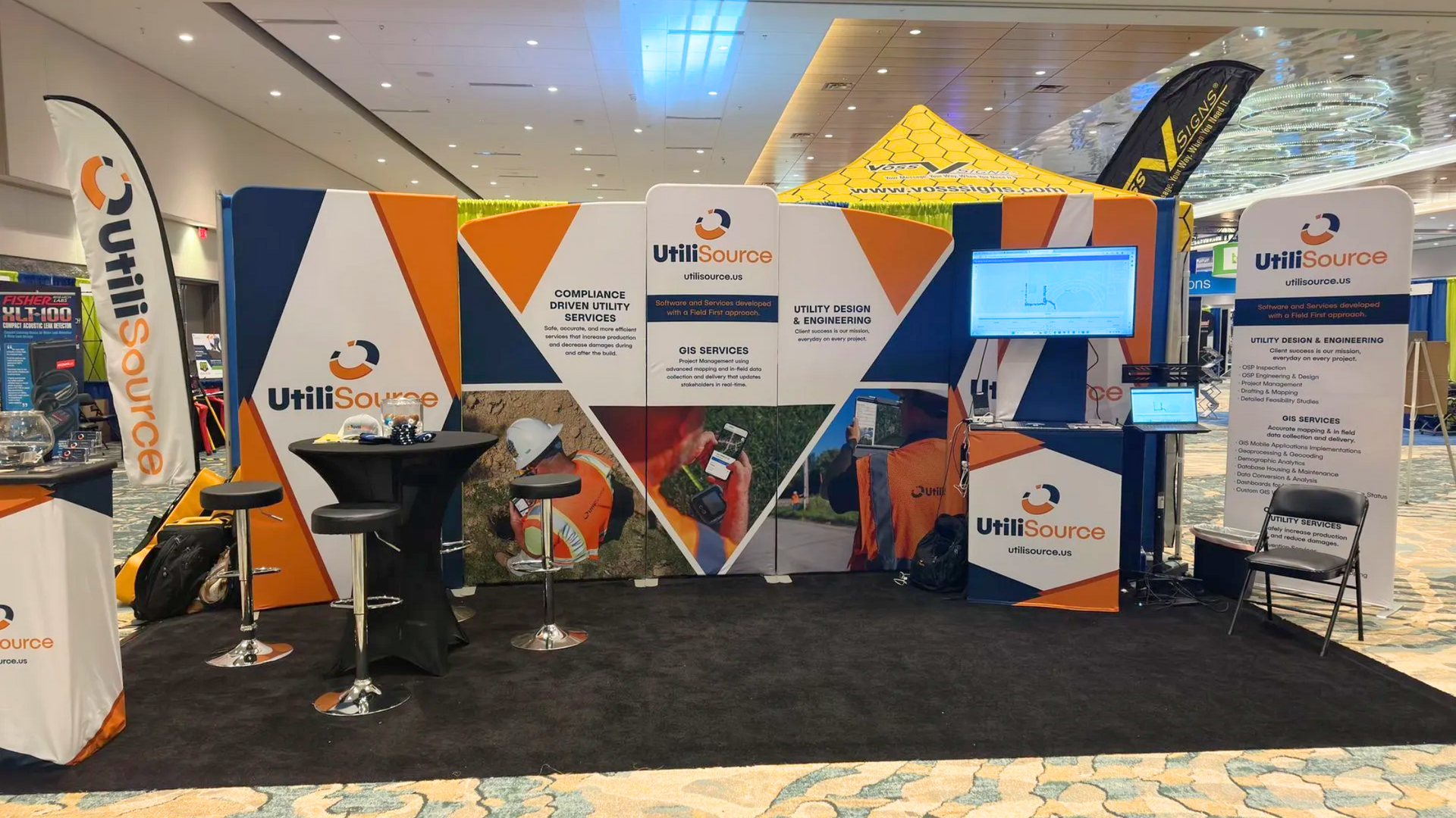
Have you ever walked into an event and immediately felt amazed because the signage was on point? The right signage helps guests navigate and adds to the overall vibe. Whether hosting a corporate conference or a wedding, choosing the right materials can set the perfect stage for a memorable experience. At Cool Touch Graphics, we're all about creating custom signs that make your event pop! Whether you're looking for something bold, sleek, or unique, we've got a variety of premium materials to bring your vision to life. Check out the options below to see which one’s the perfect fit for your event!
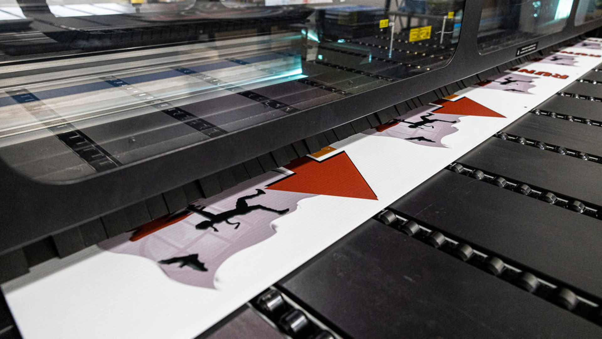
Ever feel like you can’t escape ads? They’re everywhere—on the streets, in parks, the mall, and even in your neighborhood. If you're running a business and not investing in large format prints, you might be overshadowed by all those more prominent, bolder brands grabbing the spotlight. If you want to boost your brand visibility and get noticed, it’s time to think big with large-format designs. At Cool Touch Graphics, we’re all about helping businesses stand out, and one of the best ways we do that is with our high-quality large-format printing services . This article will explain large-format printing, its benefits and applications, and why it's a game-changer for your brand. Ready to go big and make a lasting impression? Let’s jump in! What Exactly is Large Format Printing? Also known as wide-format or grand-format printing , large-format prints are typically at least 18 inches wide, but they can be as large as you want—think signs that are 100 inches or larger. Large-format printing requires specialized, high-quality equipment to pull off those massive projects. For example, a roll-to-roll printer is perfect for paper, plastic film, or vinyl materials. In contrast, a flatbed printer can handle thicker or more rigid materials like glass, acrylic, ceramic tile, and wood. Signs produced in large formats are a vital part of advertising and promotions across retail, hospitality, entertainment, and more industries. They’re the eye-catching visuals that help brands stand out and grab attention. The Benefits of Large Format Printing 1. High Visibility Large-format prints are designed to be seen from a distance, making them perfect for attracting attention in high-traffic areas. Whether on a billboard on a busy highway or a banner at a trade show, large-format prints ensure your message is visible and impactful. 2. Durability Large-format prints are made to withstand various environmental conditions. Using high-quality inks and materials, they are resistant to fading, tearing, and weather damage, ensuring your visuals remain vibrant and intact over time. 3. Cost-Effective Marketing Despite their size, large-format prints are a cost-effective marketing solution. They offer a high return on investment by providing long-lasting visibility and reaching a wide audience with minimal recurring costs. 4. Brand Reinforcement Large-format printing helps reinforce your brand identity by showcasing your logo, colors, and messaging boldly and consistently. This strengthens brand recognition and ensures your brand stays top-of-mind. 5. Versatility Large-format printing offers endless possibilities for creativity and application. From indoor to outdoor use, its versatility allows you to create custom designs that fit your specific needs and goals. Go Big with Cool Touch Graphics As you can see, large-format prints are a fantastic way to make a statement, and we’re here to make it happen! Cool Touch Graphics uses state-of-the-art printing technology to deliver sharp, vibrant, and spot-on results. We only use the best materials to guarantee durability and longevity. Our design team works with you every step of the way to create graphics that truly represent your brand. Plus, with our quick turnaround, you’ll have your prints when needed! We work with a variety of materials, including: Vinyl Plastic Fabric Metal PVC Canvas Wood Foam We also specialize in a wide range of large-format prints, such as: Banners and posters Trade show displays Vehicle wraps Billboards Storefront signs Window graphics Wall murals Floor decals Event signage And more Check out our large-format products and reach out to us for a quote !
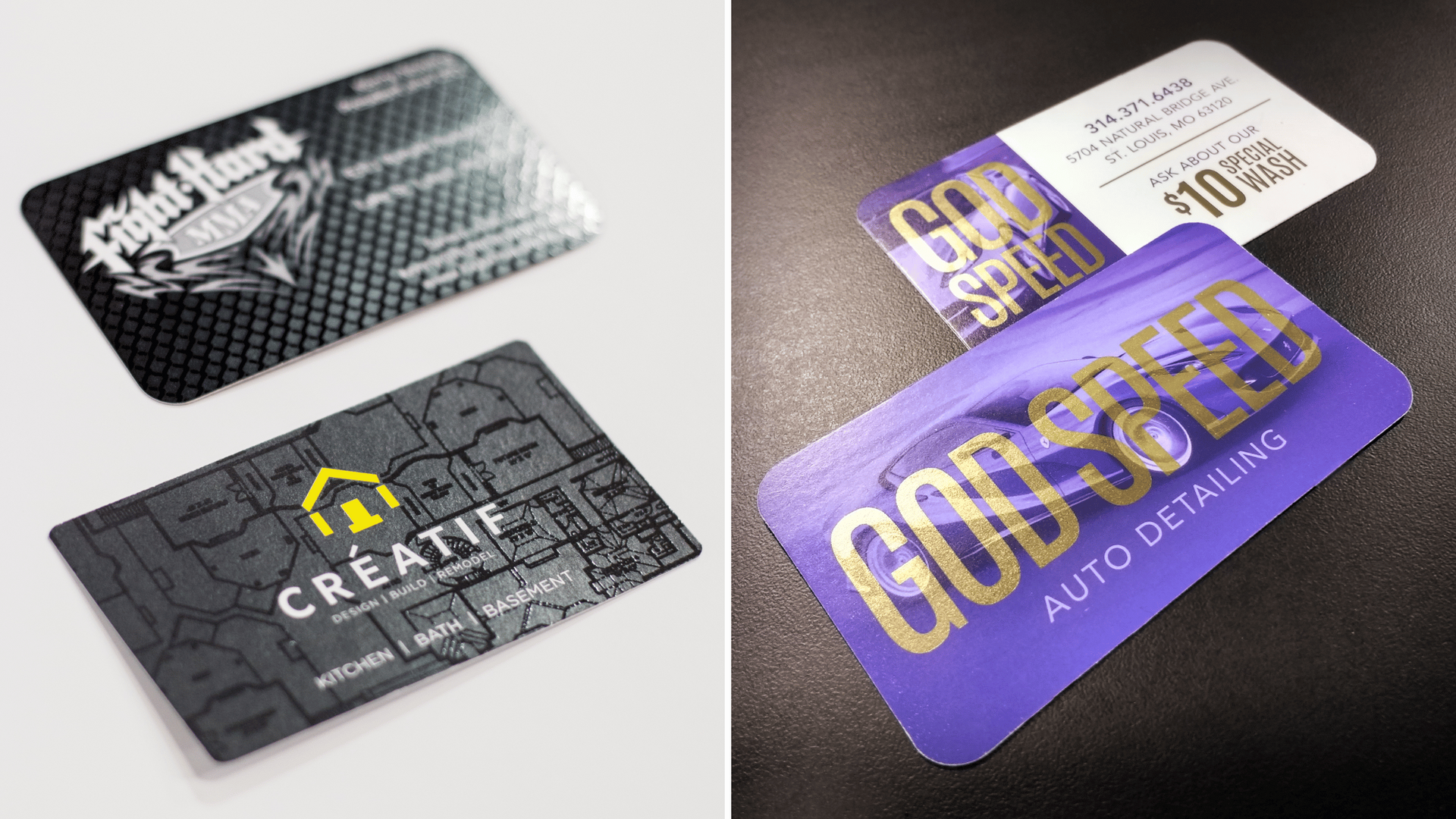
Welcome to the world of business cards—where first impressions are made and lost in the blink of an eye! Did you know that 72% of people judge a company by its card? Yep, it’s true! Believe it or not, 39% might even walk away from a business if they feel the card looks “cheap.” So, if you think a flimsy card won’t affect your reputation, think again! In this blog, we’ll explore different types of business cards and share how we can help you design one that stands out for all the right reasons. Let’s unlock doors you didn’t even know existed with the power of a killer business card! Types of Business Cards Not all business cards are created equal! Here’s a quick rundown of the different types you might consider: 1. Standard Business Cards The classic rectangular card, typically 3.5” x 2”, is versatile and easy to carry, making it perfect for any networking event. It gives you just enough space to share your essential details without overwhelming the recipient. 2. Die-Cut Cards Want to stand out in a sea of sameness? Die-cut cards come in unique shapes or designs that reflect your brand’s personality. They’re ideal for creative industries like design, art, or entertainment, where making a memorable impression is key. 3. Folded Cards Think of these as mini brochures! Folded cards offer extra space to provide detailed information about your services, showcase your portfolio, or even include a short testimonial. They’re perfect for businesses with much to say but want to keep it organized and visually appealing. 4. Magnetic Cards These are like mini billboards for the fridge! Magnetic cards stick around long after you leave the room, making them ideal for service-oriented businesses like plumbers or electricians, where clients might need your contact info immediately. 5. Loyalty Business Cards These cards are designed to encourage repeat business. Whether a coffee shop offers a free drink after ten purchases or a salon gives a discount on services, loyalty cards create an incentive for customers to keep coming back. They’re a fun way to engage with your customers and build lasting relationships. Choosing the right card type depends on your brand and how you want to connect with potential clients. Each option has unique strengths, so think about what best fits your business! Let Cool Touch Graphics Design Your Perfect Business Card A great business card should reflect your brand and make a memorable impact. Here’s how we can help: Personalized Approach: We start by understanding your vision and goals, ensuring every element aligns with your brand identity. Premium Materials: A flimsy card doesn’t just feel cheap; it can make your business seem unprofessional. At Cool Touch Graphics, we use high-quality materials so your card feels as good as it looks: ◌ Thick Cardstock: Durable and substantial, making your card stand out. ◌ Textured Paper: Adds a tactile element that people will remember. ◌ Glossy and Matte Finishes: Choose the finish that best suits your brand’s aesthetic. Creative Yet Professional: Our designs strike the perfect balance, making your card stand out while conveying trustworthiness. We can make your business cards truly unique with special features such as foil stamping, embossing and debossing, and spot UV coating. Trend Awareness: We stay updated on the latest design trends and techniques, ensuring your card is modern and memorable. Don’t Leave Your First Impression To Chance! Designing a business card may seem easy, but teaming up with pros makes all the difference! DIY cards can feel cluttered and miss your brand's vibe, harming your image. Our experts know how to make your card pop and leave a lasting impression. Ready to wow your audience? Let Cool Touch Graphics bring your vision to life— request a quote today !
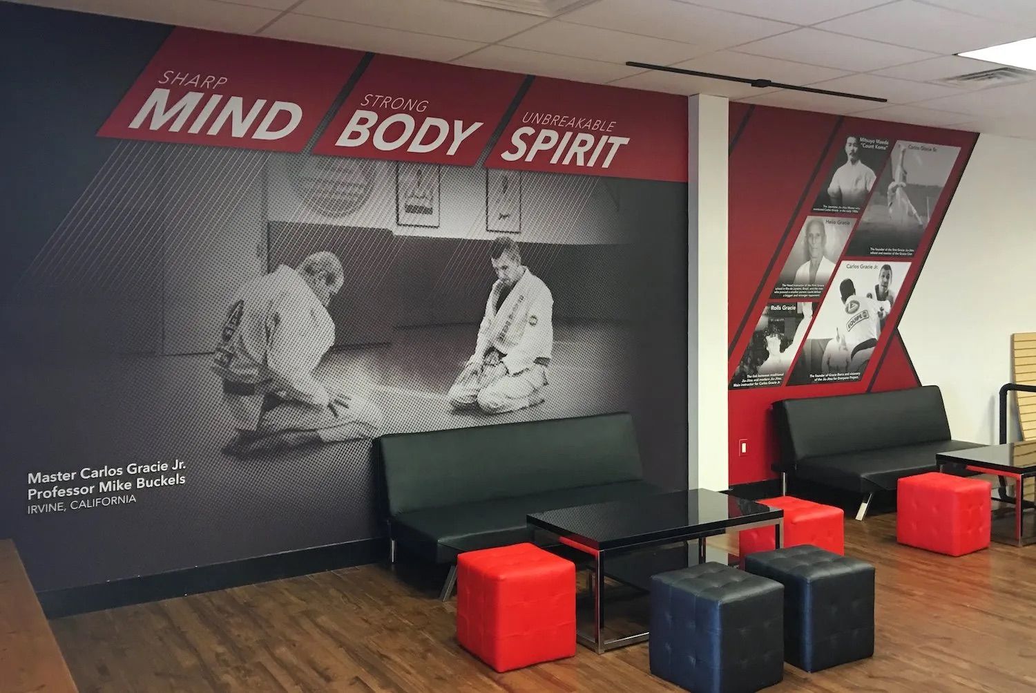
You know what they say: you only get one chance to make a first impression. Whether you’re meeting a new client or welcoming a business partner, that first moment matters more than you might think! Your lobby is the first thing they see, and it’s crucial to make it count. This space isn’t just a waiting area; it reflects your brand and the vibe you want to convey. At Cool Touch Graphics, we’re all about helping you transform your lobby into a stunning first-impression powerhouse. Here are some areas to focus on and ideas for elevating them with custom signs and graphics. 1. Entrance Area First things first, your entrance is the first thing visitors see. Why not start with a bold statement? Consider a large, eye-catching wall graphic that showcases your brand’s personality. Whether it’s a mural that tells your story or an inspiring quote that resonates with your values, this is the place to grab attention! From intricate designs to brand-centric visuals, Cool Touch Graphics can create stunning murals that captivate and inspire. 2. Reception Desk Your lobby's reception desk is a central feature, making it the perfect canvas for expressing your brand’s style and fostering a friendly atmosphere. A custom sign or a sleek, dimensional logo can add some personality. You might also consider a fun vinyl wrap to introduce some color or pattern to the desk while protecting it from scratches and stains. If you're looking for ideas, we’re here to help you design something representing your brand! 3. Waiting Area Now, let’s talk about the waiting area! You want guests to feel comfortable while they wait. Use high-quality furniture for added comfort, and don’t overlook the impact of large-format prints, wall decals, and dimensional letter signs . These elements enhance the aesthetic and bring a touch of sophistication and professionalism to your lobby. 4. Information Station Every lobby needs a spot for information. Elevate this area with clear and well-designed wayfinding and directional signs that effortlessly guide visitors to different parts of your facility. By collaborating with Cool Touch Graphics, you can ensure your signage is functional and visually appealing, making navigation a breeze for everyone. 5. Refreshment Corner If your lobby has a refreshment corner, why not make it a fun focal point? Custom graphics can enhance the space, perhaps with a playful coffee-themed wall wrap or motivational quotes to keep spirits high. You can also use unique labels or custom stickers for drinks or snacks that reflect your brand’s style. 6. Lighting Lighting can make or break your lobby’s vibe. Pair custom signs and graphics with smart lighting solutions to highlight specific areas. Think of backlit signs or illuminated displays that create an inviting ambiance and a memorable first impression. Transform Your Lobby with Cool Touch Graphics! With endless options for custom signs and graphics , creating a standout lobby has never been easier with Cool Touch Graphics! We use high-quality materials and offer custom designs tailored to your vision. Plus, our professional installation guarantees a flawless finish. Schedule a consultation today , and let’s turn your lobby into a space that leaves guests saying, “Wow!”

